Saturday 31 March 2012
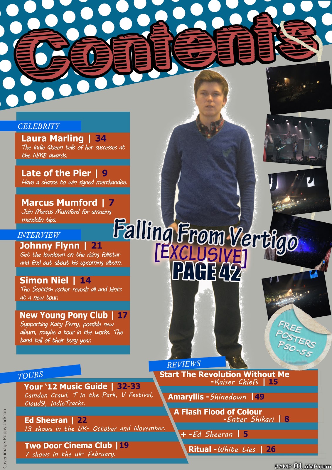
Contents Font
I have limited my selection of contents fonts to these which convey creativity and youth with their childish style. I will conduct a short survey to find out which Contents font they are most in favour of.

My focus group decided by a land-slide that the bottom font was a clear winner, with further comments of:-
"The bottom option gives a more intriguing feel to the overall look of the magazine."
"It gives a textured looks rather than plain and flat page"
Decline of Sales Figures
The ABC figures show a vast decline in the yearly circulation of NME
magazine by 17.6% from 56,000 to 18,000. This appears to be a trending event
throughout all magazines with Q magazine fell by 20% respectively. As of 2012,
the biggest selling music magazines Mojo’s
circulation also fell by 2.4% to 85,000.
This correlation of falling magazine sales and the distribution increase
of free title magazines such as Fly to
108,827 copies displays the trend in which magazines are going, relying upon
advertising rather than selling to the public.
Title
|
Publisher
|
Jun End 2012
|
Yr / Yr Change
|
Empire
|
Bauer Consumer Media
|
167,096
|
-2.3%
|
Total Film
|
Future Publishing
|
68,897
|
-4.1%
|
Mojo
|
Bauer Consumer Media
|
85,149
|
-2.4%
|
Q
|
Bauer Consumer Media
|
64,596
|
-19.7%
|
Uncut
|
IPC Media
|
63,003
|
-4.5%
|
Kerrang!
|
Bauer Consumer Media
|
40,203
|
-6.6%
|
New Musical Express
|
IPC Media
|
23,924
|
-17.6%
|
Due to my magazine focusing on a different, niche market I will continue to sell my magazine for a trial period of 1 year but if the magazine fails to meet the circulation figures, switching to a free magazine will be more practical in terms of cost and creating quality content.
Audience Profile and Convergence
Audience:
- 15-20 year old teens; this is the most predominant age in which music is most influential and important in their lives which raises the importance of my magazine. If regarding this is the view of Uses and Gratification it too raises the importance of my magazine as a social aid in being a creator of social interaction and a route of escape.
- ABC1/2 Social classification; this makes sure that my magazine is adequately priced and affordable for my target audience. This social classification is generally the most inclined to buy magazines too, so in turn, this makes sure my target market is of an appropriate audience.
- Mixed gender; this opens up my magazine to target more audiences and increase sales.
- Social networking is of high importance; as seen, this will aid my interactions with my audience to find out what aspects of my magazine they like and dislike to make my magazine a more successful venture and this will also aid in reaching audiences who are not my specific target audience.
Rolling Stone Convergence:
The traffic which RollingStone.com receives shows the importance of convergence. Reaching 2.7million unique users a month via computers alone shows the vast audience it unlocks, especially when scaled against its 68,000 monthly readership. Social extensions alone offer up major advertising opportunity with Rolling Stone having 567,000 Facebook fans and a total of 1,640,000 Twitter followers as of June 2012. Having such a wide audience at such a constant source of interaction is a major advertising opportunity and also gives an aspect of interaction with their audience to further their knowledge of their chosen audience and increase interactivity with this audience.
Friday 9 March 2012

Unfinished Two Page Spread Comments
I decided to try out some of the ideas that the people suggested for my Two Page Spread. First was the red and black idea:
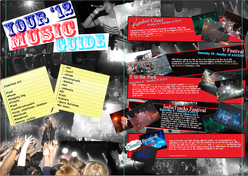
This did look good but I felt it was too rocky, especially with the colour connotations from the red and black, so I ultimately decided not to go with this idea.
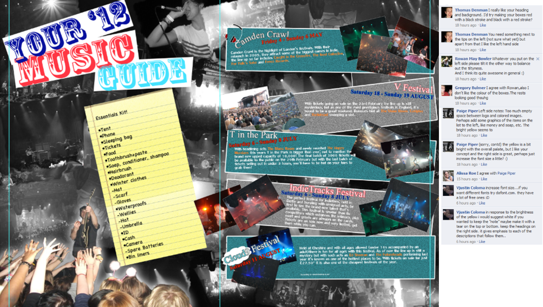
Next was the white, torn notes option:

I liked this idea a lot, I agree the yellow was too harsh and it wasn't set out in a visually pleasing manner. The white constrasts with the black and white background and aids in the house-style I tried to create.
Subscribe to:
Posts (Atom)